Why Every App Now Looks the Same: The UI Clone Wars
Open any app in 2025 and you’ll see it:
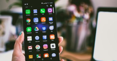
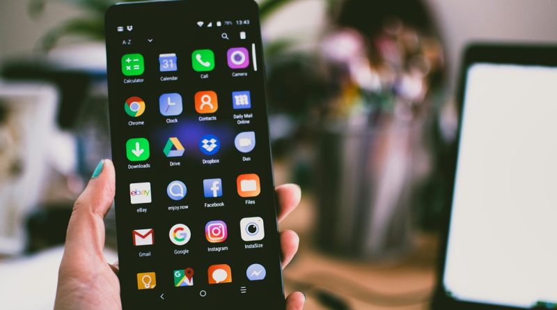
Rounded rectangles. A bottom navigation bar. A hamburger menu tucked in the corner. Muted color palettes. A safe shade of off-white or grayscale. Dark mode, by default.
No, you didn’t open the same app twice — it just looks that way.
Welcome to the UI Clone Wars, where design innovation has been replaced by copy-paste conformity.
The Rise of the Template Mindset
Blame it on trends. Or Figma kits. Or the endless stream of “Best UX Practices” blog posts. Whatever the cause, today’s developers and designers are less likely to invent — and more likely to adapt.
Using Material Design, iOS Human Interface Guidelines, and UI kits from Dribbble or Behance, startups now launch faster by avoiding risk. And that’s the problem: faster doesn’t always mean better.
Safe Is the New Risky
Design sameness isn’t just about aesthetics. It affects user behavior, brand recognition, and emotional impact.
- When every app feels the same, users become less engaged.
- When you can’t visually distinguish between brands, loyalty suffers.
- When innovation is filtered through what already works, nothing new really lands.
This isn’t just laziness. It’s strategic — but it’s also creatively bankrupt.
The Algorithm Made Me Do It
Apps are now designed to perform, not just to look good. Designers optimize for retention, click-through rates, and “conversion paths” — which often means following what’s already working elsewhere.
Instagram Stories? Now on YouTube, LinkedIn, even Spotify.
Swipe cards from Tinder? Now in food delivery, job apps, and more.
Functionality is driving visual convergence. But somewhere along the way, soul got sacrificed for scrollability.
The Figmaification of Creativity
Design tools have democratized UI design — and that’s a great thing. But they’ve also created a monoculture. When every designer is starting from the same template, the outcomes become alarmingly uniform.
It’s a world where creativity is smoothed out by sliders, color pickers, and component libraries.
Great for speed.
Not so great for originality.
So What’s the Fix?
- Start from zero, not from a kit.
- Focus on emotional design, not just user flow.
- Accept friction where it makes sense — not every app should be frictionless.
- If you’re a user: seek out apps that feel weird. Weird is good.
Because in a world where every app feels the same, the one that feels different is the one that sticks.
💬 Parting Thought:
In the rush to make everything intuitive, we’ve made everything indistinguishable.
The UI Clone Wars are real — and unless someone breaks the loop, the future of app design will look a lot like… yesterday.